Works
Drive Maxx Brand Update
Category leader in driveway repair gets a much needed update.
Leak Stopper
Leak stopper was long overdue for an update. Positioned as the entry level price point and DIY champion in the…
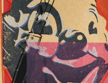
Har Mar Superstar
Various posters and album art that I’ve created with the legendary Har Mar Superstar over the years.
IdeaPaint
IdeaPaint Invented the category of dry erase paint. An incredibly durable coating that rolls on like regular paint, but turns…
Poe: A Rock Musical
A journey into the enigmatic world of Edgar Allan Poe that unravels the tapestry of the young poet’s troubled dream…
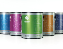
Scuffmaster Paint
Full identity, print and web evolution for a great Middle-West paint company.
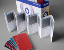
Scuffmaster Box Set
Take the best product, and the best colors, and put it in a easy-to-access box that’s as functional as it is cute? Who’s idea was this?!
Raws For Paws
This type of packaging is called a chubb. So now you know.
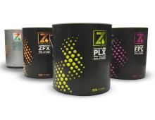
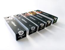
Zolatone Paint Packaging
If you think paint is boring it’s only due to that tiresome cliche about watching it dry. That, and you’ve never seen Zolatone paint.
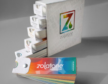
Zolatone Mini Decks
144 of the best Zolatone colors in a handy little take-it-on-the-go package? Yup! One Please!
Zolatone Fan Deck Towers
Nothing says loving quite like soft-touch laminate and hot foil stamping.
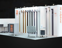
Zolatone Tradeshow Booth
With gallon cans and rollers suspended on the walls seemingly dripping and applying Zolatone finishes, this space screamed paint.
Blue Q
Design and illustration for Blue Q gifts and confections.
Identity
A handful of identities developed for everything from large companies to start ups. Nothing hits the spot like a nice logo.
Plastock Portraits
Several images from the Plastic Portraits series that I shot for CSA Images.
CSA Plastock
Here’s a handful of the over 2,000 photos I shot for Charles S. Anderson’s Plastock Collection.
Random Prints
Here’s a look at a few of the prints I’ve made for kicks over the years.
MCT Sample Stuffers
A couple of fun items designed to spice up MCT’s sample program.
High Voltage Rock Music!
Here’s a collection of posters, album art, 7″ singles and more for some really great bands.
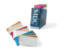
MDC Paints
Color selection tools for MCD’s line of interior paints.
MYDT Theater Promotions
Series of posters created to promote events by the Midwest Youth Dance Theater.
Toyota Tundra
Poster designs for Toyota’s new Tundra full-size truck.
3M Privacy Filters
Naming and packaging for 3M’s line of privacy filters.
Catholic Healthcare West
Various publications and outdoor campaigns for the 5th largest hospital system in the nation.
Cook Medical
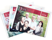
Broadsheet newspapers, flyers, banners, brochures and more to promote the Cook Medical story.
Tishman Speyer
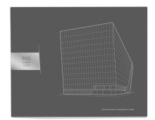
Promotional material for Tishman Speyer, an international real estate developer for some of the world’s most recognized buildings.
IBM Connector Guide
Promotional package for IBM’s employee network program, The Greater IBM Connection.
French Paper Co.
Brochure created for the launch of Smart White, the premium line of white uncoated papers from French.
Product Photography
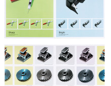
A collection of product photography shot on assignment for CSA Images.


